RESEARCH – MAGAZINE CONVENTIONS
- Luca Zahan
- 4 days ago
- 3 min read

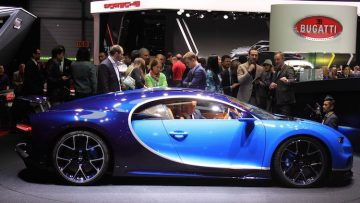
Before creating my own magazine, I researched the main conventions used in professional publications in order to understand how they are structured and how they communicate with their audience. I looked at automotive magazines such as Top Gear Magazine, Octane Magazine, Classic & Sports Car, and the official Ferrari Magazine.
This research helped me identify the key elements that appear consistently across magazines, while also showing how they can be adapted depending on the target audience and style.
Key Magazine Conventions
Masthead
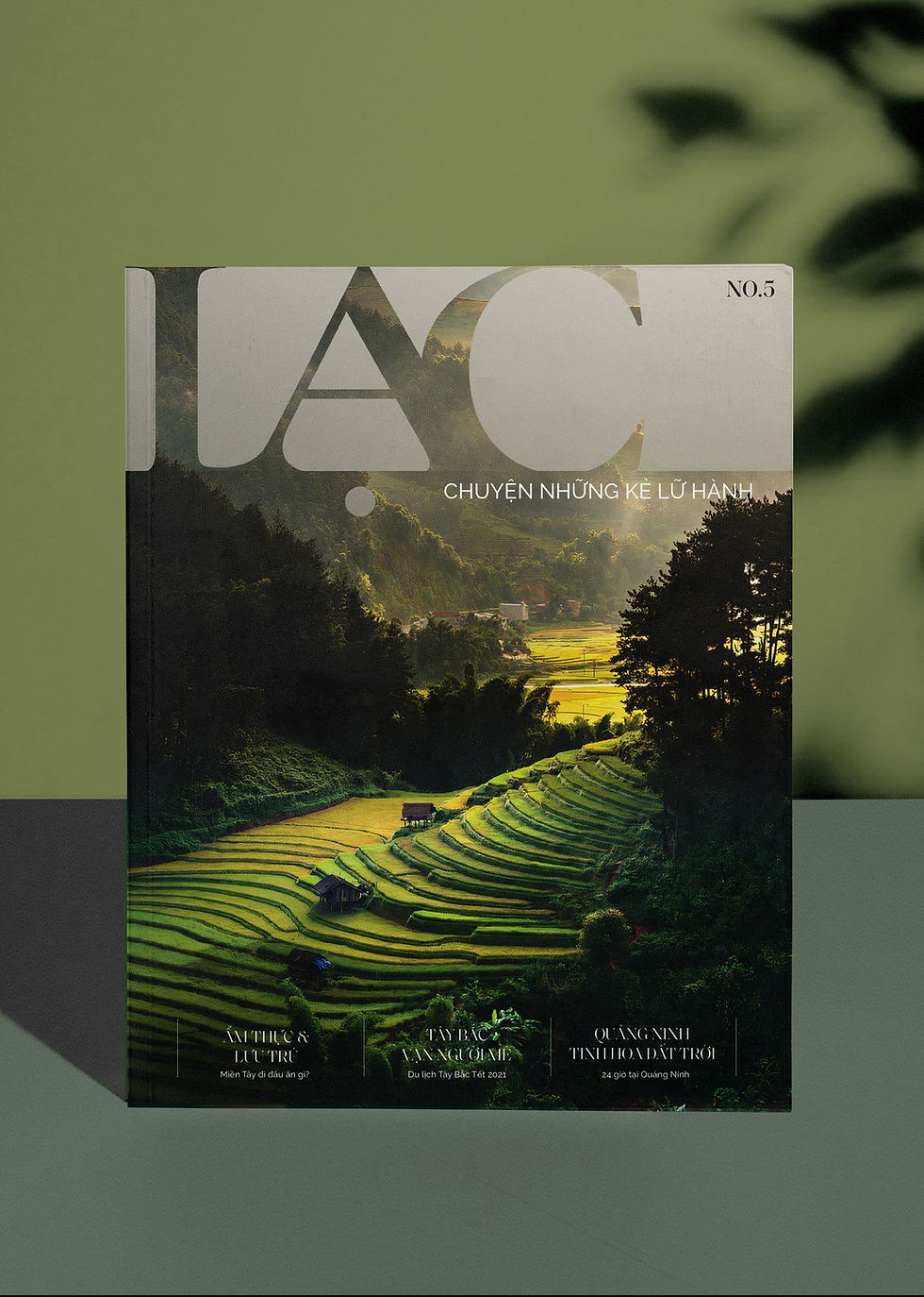
The masthead is the title of the magazine, usually positioned at the top of the cover. It is one of the most important elements, as it creates brand identity and makes the magazine recognisable.
In my magazine, I will use a serif masthead with a clean and minimal design, inspired by luxury brands. This will help communicate a premium and timeless feel.
Main Cover Line
The main cover line is the largest piece of text on the cover and usually relates to the main feature or article. It is designed to immediately attract the reader’s attention.
For my magazine, the main cover line will focus on a specific car or exclusive feature, highlighting rarity and importance rather than using exaggerated or sensational language.
Cover Lines
Cover lines are smaller pieces of text that provide information about additional content inside the magazine.
In many commercial magazines, such as Top Gear, these are used heavily to attract attention. However, in more premium magazines, they are often reduced.
In my case, I will limit the number of cover lines, as I want to maintain a clean and elegant look.
Main Image
The main image is typically the most dominant element on the cover. It is used to attract the audience visually and set the tone of the magazine.
For my magazine, the image will be the central focus, featuring high-quality photographs of cars. This is especially important, as the audience is likely to value the visual presentation as much as the written content.
Strapline
A strapline is a short phrase that communicates the identity or purpose of the magazine.
While some magazines use strong straplines, I may choose to keep mine minimal or subtle, so it does not interfere with the overall aesthetic.
Barcode, Date and Price
These are standard elements that appear on most magazine covers. They provide practical information and are usually placed in a corner of the page.
In my magazine, I will include these elements, but I will position them discreetly, so they do not distract from the design.
Contents Page

The contents page helps the reader navigate the magazine by listing the main sections an
d articles.
Typically, it includes:
Section headings
Page numbers
Short descriptions
For my magazine, I will design a clean and structured contents page, focusing on clarity and balance rather than filling the page with too much information.
Double Page Spread
The double-page spread is the layout used for main articles inside the magazine. It usually combines images, text, and headings.
In more commercial magazines, these spreads often include a lot of text. However, in luxury magazines, they tend to be more image-focused.
For my magazine, I will prioritise:
Large, high-quality images
Minimal but well-placed text
Elegant typography
Linking to Real Magazines
These conventions can be clearly seen in magazines such as Ferrari Magazine and Top Gear. However, the way they are used differs depending on the audience.
For example:
Ferrari Magazine uses minimal text and strong imagery to create a luxury feel
Top Gear uses multiple cover lines and bold typography to appeal to a wider audience
I will explore these differences in more detail in my magazine analysis.
Reflection
Overall, this research helped me understand that magazine conventions are not fixed, but flexible. While most magazines use the same basic elements, the way they apply them depends on their purpose and target audience.
For my magazine, I will adapt these conventions to create a minimal, luxury-focused product, where the emphasis is placed on image quality, simplicity, and exclusivity rather than quantity of information.
Comments