RESEARCH – GENRE & MOODBOARD
- Luca Zahan
- 4 days ago
- 2 min read

THE CHOICE
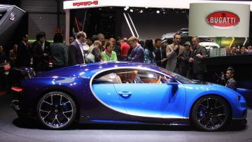
After analysing different types of magazines in my previous research, particularly Top Gear and the official Ferrari Magazine, I decided that my magazine will focus on the luxury automotive genre, more specifically on collector cars, classic vehicles and limited production models.
From that analysis, I understood that different magazines approach the same subject in very different ways. While Top Gear targets a wider audience through a more dynamic and content-heavy style, Ferrari Magazine follows a much more minimal and refined approach.
Based on this, I chose to move in the direction of a premium, niche publication, as it better fits both my concept and my target audience. The intention is to create something closer to a collector’s item or an auction-style magazine, where each car is presented as something rare and valuable.
VISUAL DIRECTION
Following this decision, I developed a visual direction that reflects the same ideas of exclusivity and simplicity.
From my research, I noticed that luxury magazines tend to:
use neutral colour palettes (white, black, beige)
rely on large, high-quality images
avoid overcrowding the page
use clean and elegant typography
Compared to more commercial magazines, which often use bright colours and a large amount of text to attract attention, this approach feels more controlled and intentional. It creates a more refined experience and suggests that the content does not need to compete for attention.


MOODBOARD
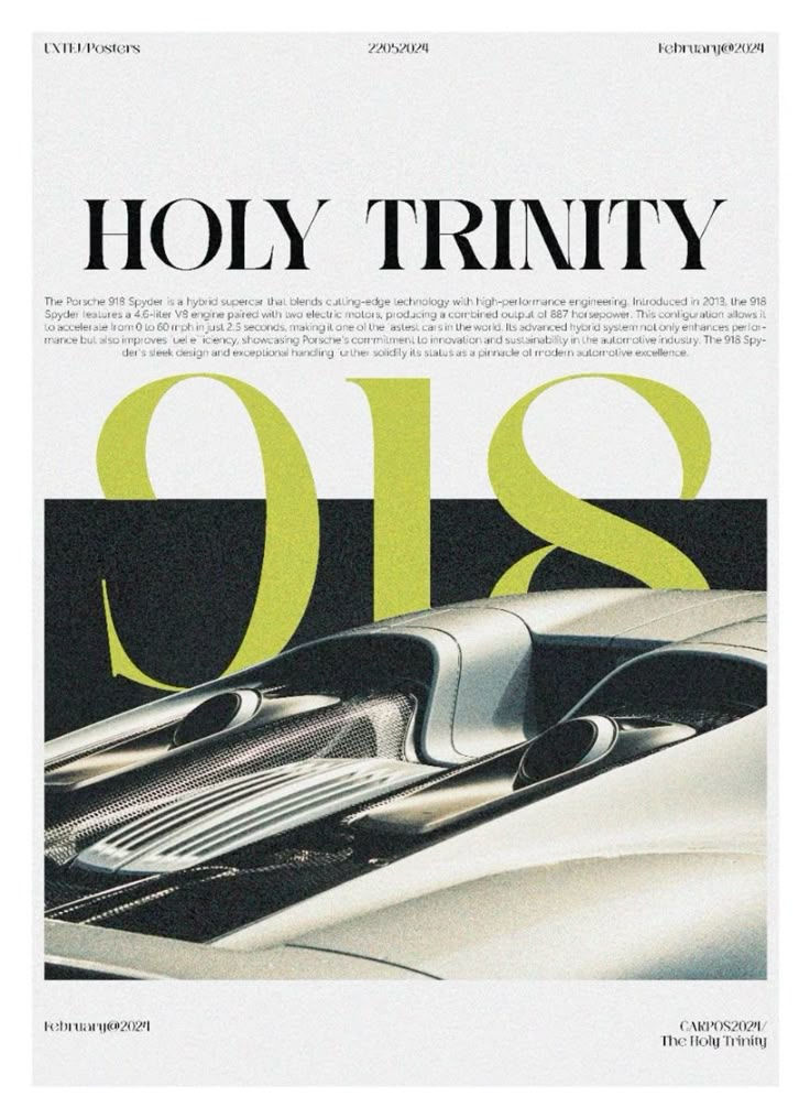
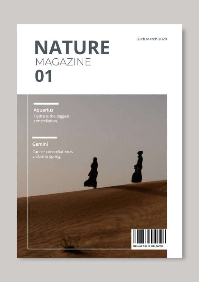
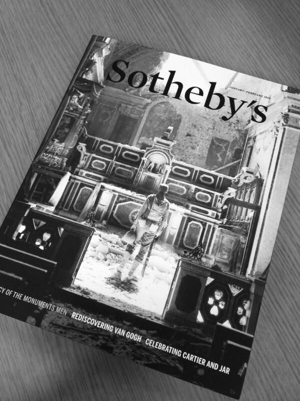
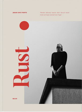
To better define this visual direction, I created a moodboard using a selection of images that reflect the style I want to achieve.
Most of the images focus on car photography, where the vehicles are presented in clean and minimal environments. I was particularly drawn to compositions that isolate the car and avoid unnecessary background elements, as this allows the design of the vehicle to stand out.
I also included a small number of images showing interiors and close-up details, which help communicate the craftsmanship and quality of the cars. Even though these are not the main focus, they add depth and contribute to the overall luxury feel.
In addition, I selected examples of magazine covers and editorial layouts, which helped me understand how professional publications structure their pages. What stood out to me was the use of space, simple typography, and the emphasis on strong visual hierarchy.
DESIGN INTENT
What became clear from this research is that luxury automotive magazines rely more on simplicity and precision, rather than visual overload. Each element on the page has a clear purpose, and nothing feels unnecessary.
This is very different from more mainstream magazines, where the focus is often on capturing attention quickly through colour and quantity of content. In contrast, the minimalist approach creates a more calm and premium experience, which fits the expectations of a more selective audience.
LINK TO MY MAGAZINE
This moodboard directly influenced the direction of my own magazine.
When creating my pages, I will:
use fewer but more impactful images
maintain a clean and structured layout
avoid unnecessary elements that could make the design feel crowded
Overall, I want the final product to feel more like a carefully designed object, rather than a typical magazine. This approach reflects both the genre I have chosen and the audience I am targeting.
Comments