PLANNING – MASTHEAD
- Luca Zahan
- 4 days ago
- 2 min read

Choosing the name
At the beginning of my planning process, I explored multiple name ideas in order to find something that reflects the identity of my magazine. Since my concept focuses on luxury and collector cars, I wanted a name that feels premium, elegant, and timeless.
Some of the ideas I considered included:
Aureum – inspired by the Latin word for gold, representing luxury and value
Apex – suggesting the highest level or peak performance
Obsidian – associated with a dark, sharp, and premium aesthetic
Vantage – linked to perspective and also used in automotive contexts
Échelon – representing exclusivity and elite status
Catalogue – inspired by auction house catalogues, giving a collectible feel
All of these names were relevant, but I was looking for something that connects more directly to automotive culture.
I ultimately chose VELOCITÀ, which means speed in Italian. I felt this was the strongest option, as it links directly to brands like Ferrari and to the heritage of performance cars, while still sounding refined and premium.
Initial ideas and sketches


Before creating the logo digitally, I started by sketching out ideas on my e-ink tablet. This helped me visualise how the masthead could look and allowed me to quickly test different directions.
I created two main concepts:
A simple version, based on clean text with a subtle underline
A more complex version, which included additional styling elements above the text
This stage was important because it allowed me to experiment freely before moving into digital design.
Digital development

After sketching, I recreated both versions using Photoshop in order to see how they would look in a more realistic format.
At this stage, I also tested:
Different serif fonts (to match a luxury aesthetic)
Spacing and proportions
Colour variations, mainly focusing on gold tones
Seeing the masthead in a digital format helped me understand how it would actually function on a magazine cover.
Comparing designs
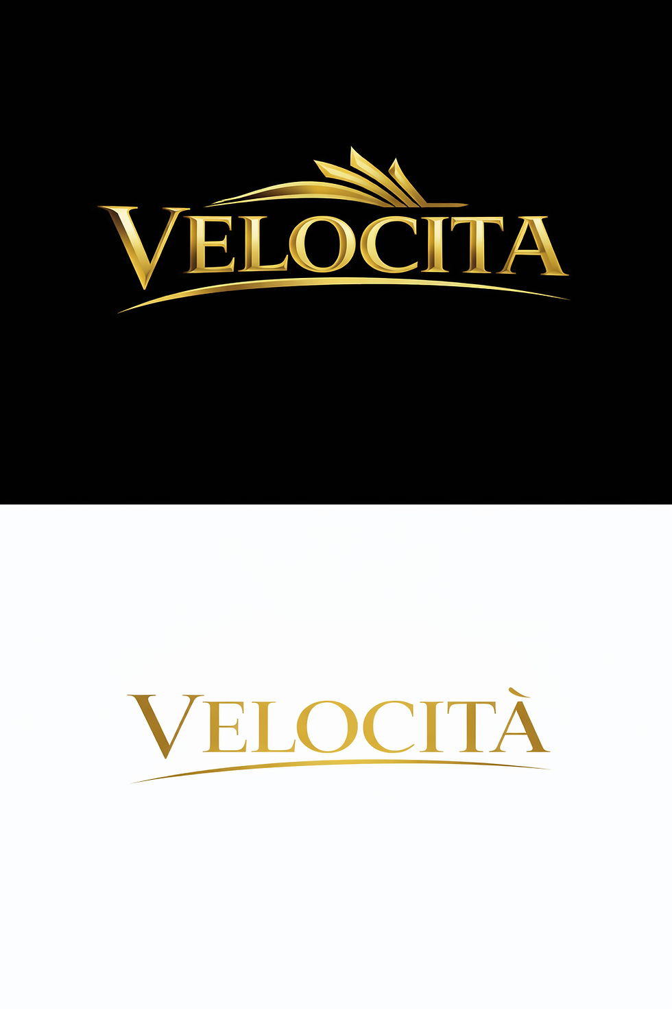
The more complex version initially felt more visually striking, as it included additional design elements and a more detailed gold effect. However, after placing it in context, I realised that it was too busy and could distract from the main cover image.
In contrast, the simpler version felt much more balanced and aligned with the minimalist, high-end aesthetic I was aiming for.
I also asked for feedback, and my sister pointed out that the simpler design looked more “premium” and easier to read, which confirmed my decision.
Final decision
As a result, I chose the simpler masthead design, using a serif font and a clean gold-based colour palette.
This version:
Fits the luxury magazine style
Keeps the focus on the imagery
Is easier to recognise and apply consistently
Overall, the masthead successfully communicates the identity of my magazine as a refined, high-end, and collectible product.
Comments