PLANNING – FLAT PLANS & TEXT
- Luca Zahan
- 4 days ago
- 3 min read

Introduction
In order to clearly visualise the structure and layout of my magazine, I created a series of flat plans for each key section: the cover, contents page, double-page spread and back cover. These sketches allowed me to experiment with composition, spacing and hierarchy before producing the final product.
My overall intention is to maintain a minimal, clean and premium aesthetic, inspired by luxury automotive publications, where the image is dominant and the text is reduced to only essential information. This reflects my concept of cars not just as objects, but as design pieces and expressions of history and emotion.
Main Cover
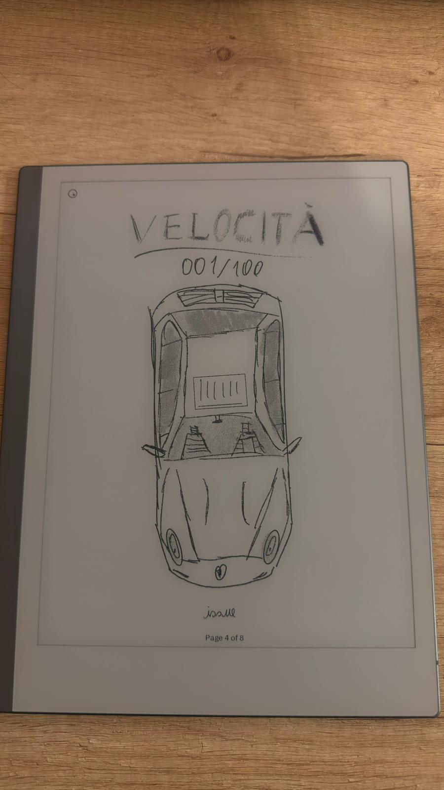
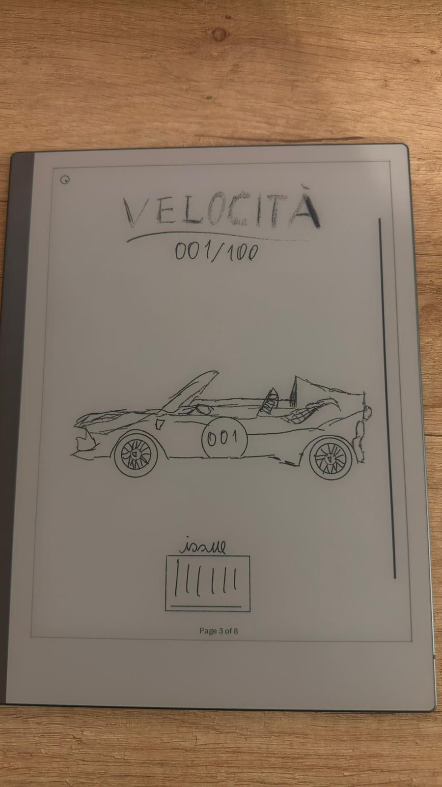

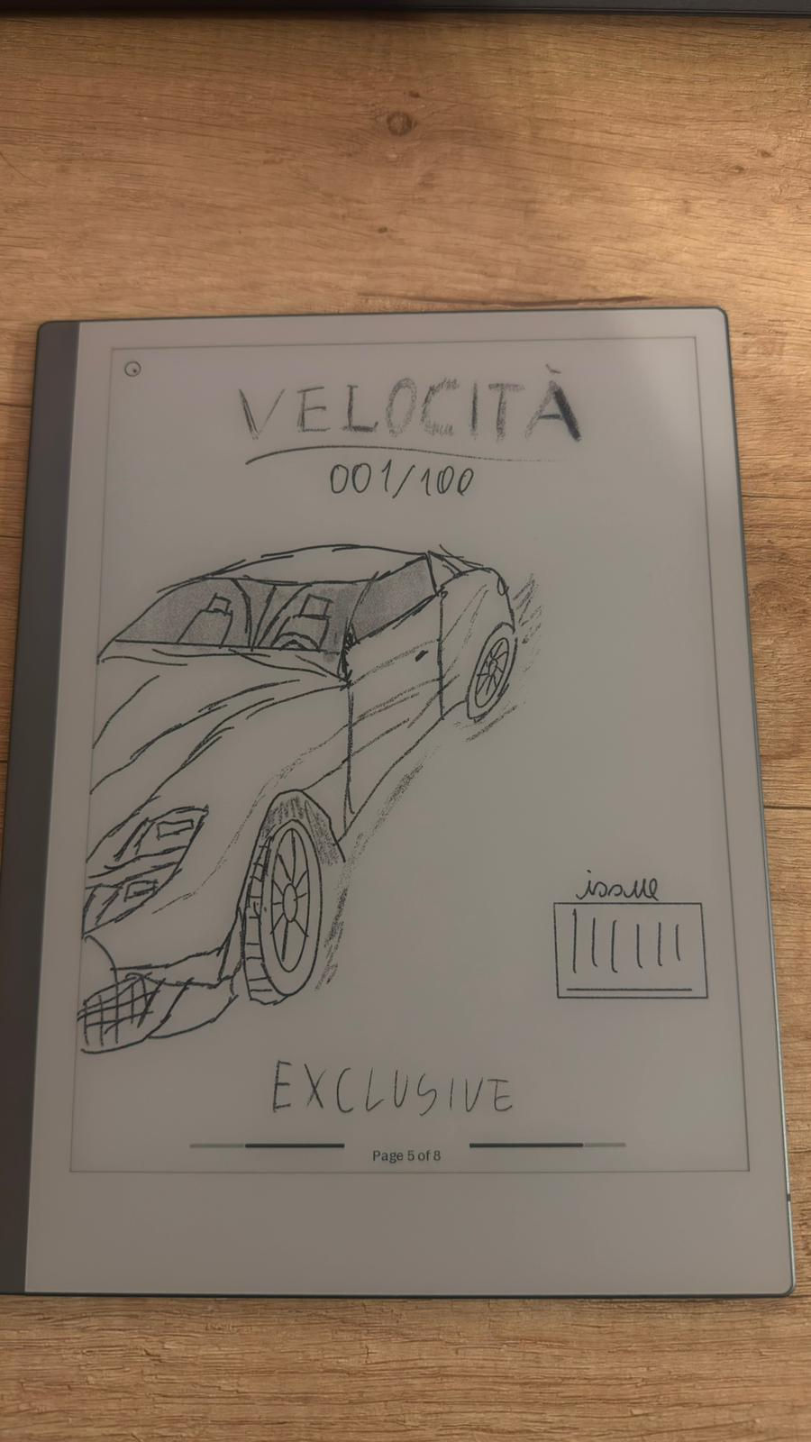
The cover went through multiple variations, but I decided to develop the fourth design further, as it best represents the identity of my magazine.
The composition is intentionally very minimal, with a strong focus on a single car image that slightly extends beyond the frame. This creates a sense of presence and exclusivity, while also making the layout feel more dynamic without becoming cluttered.
The masthead “Velocità” is placed at the top, in a simple and elegant style, accompanied by a subtle underline to reinforce the brand identity. Below it, I included a limited-edition detail (“001/100”), which suggests rarity and positions the magazine as a collector’s item rather than a mass-market product.
Unlike more commercial magazines, I chose not to include multiple cover lines, as I want the image to remain the central focus. This decision aligns with my aim of creating a luxury, gallery-like feel, where the audience engages visually before reading.
Contents Double-Page Spread
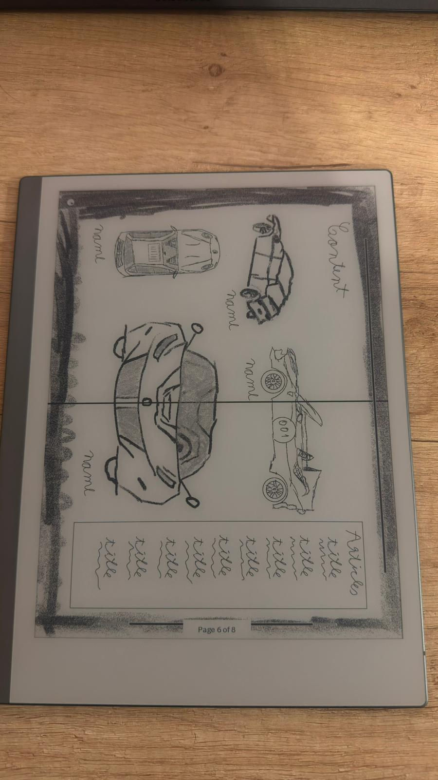
The contents page is designed as a double-page spread, which makes it feel more open and balanced compared to just one page.
I split the layout across both pages so that it doesn’t feel too crowded. One side is more focused on images, with a main central photo and a few smaller ones around it, while the other side is mainly for the list of contents.
This helps guide the reader naturally across the page, from visuals to information, without overwhelming them. I also used a column layout for the article titles, which is a common magazine convention, but I kept the amount of text quite limited.
Overall, I tried to keep the design simple and clean, so even though it’s an important and more “functional” page, it still matches the minimal and premium style of the rest of the magazine.
Double-Page Spread Article

For the double-page spread, I explored a more editorial layout, combining image and text in a clean and structured way.
One side of the spread is dominated by an image, while the other includes text and a title. This contrast creates a strong visual rhythm and ensures that the page does not feel overcrowded.
The text area is intentionally limited, as I want the audience to focus primarily on the visual aspect. The typography will remain simple and refined, reinforcing the idea that the magazine is image-led rather than text-heavy.
Back Cover
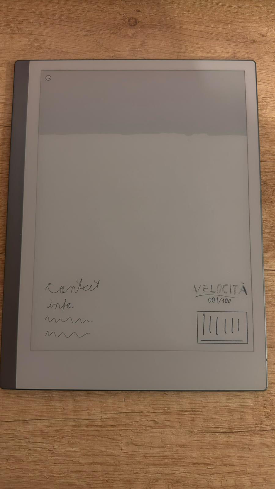
The back cover is designed to be extremely minimal. Instead of using advertisements or complex layouts, I chose to keep a large amount of empty space, which reinforces the premium feel.
In the lower corner, I included the magazine branding “Velocità 001/100” along with a barcode. This follows basic conventions while still maintaining a clean and uncluttered appearance.
This simplicity ensures consistency with the front cover and overall magazine identity.
Conclusion
Overall, these flat plans helped me define a clear direction for my magazine. Across all pages, I consistently prioritised:
minimalism over clutter
image dominance over text
luxury aesthetics over mass-market conventions
While some elements may evolve during the production process, these plans provide a strong foundation and ensure that the final outcome remains cohesive and aligned with my concept.
Comments