PLANNING – EDITORIAL / ARTICLE
- Luca Zahan
- 4 days ago
- 3 min read

When analysing magazines, it becomes clear that the editorial or feature article is one of the most important sections, as it allows the magazine to communicate its identity, style, and values to the audience. Through the combination of layout, typography, and imagery, magazines are able to create a specific tone, whether that is minimal, luxurious, or dynamic.
For my editorial, I decided to follow a luxury automotive magazine style, focusing on clean layouts, strong imagery, and minimal but effective text. This is because my target audience consists of car enthusiasts and collectors who are more likely to appreciate a refined and visually driven design rather than overly crowded pages.


Layout Inspiration
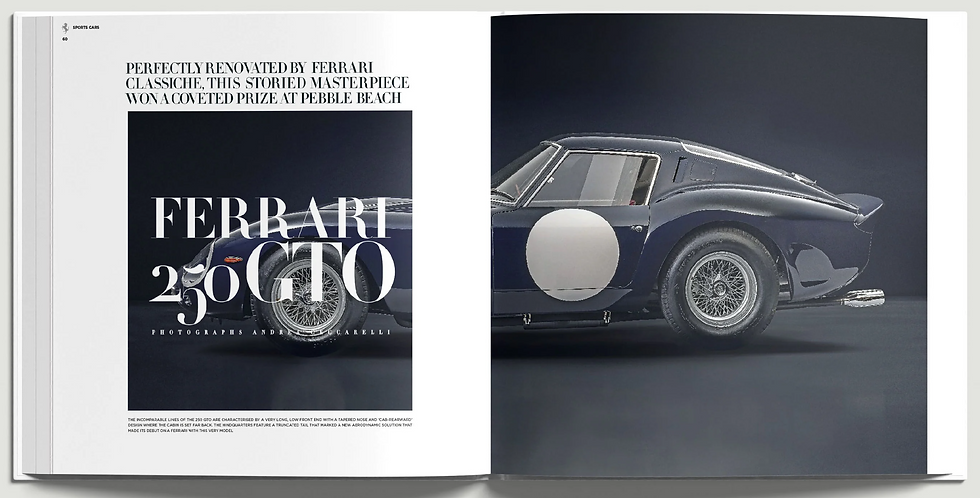
From this example, I was particularly inspired by the balanced and symmetrical layout. The use of a large, dominant image on one side and structured text on the other creates a sense of order and sophistication. The minimal colour palette and clean typography reinforce the premium feel of the magazine.
I plan to apply this in my own editorial by maintaining a clear division between text and image, ensuring that the layout feels organised and easy to follow.
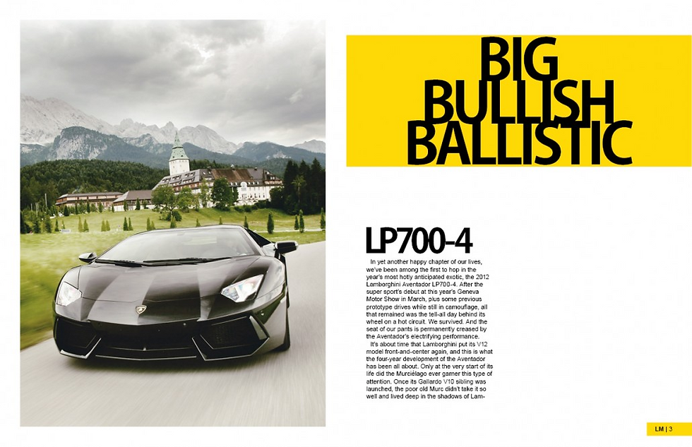
Use of Full-Page Imagery
Another key element I want to include is the use of full-page or double-page imagery. In this example, the image dominates the spread, immediately capturing the reader’s attention. The natural environment adds a cinematic and aspirational quality, which is often associated with luxury car brands.
This has influenced my decision to include large, high-quality images in my editorial, allowing the visuals to take priority and create a strong first impression.
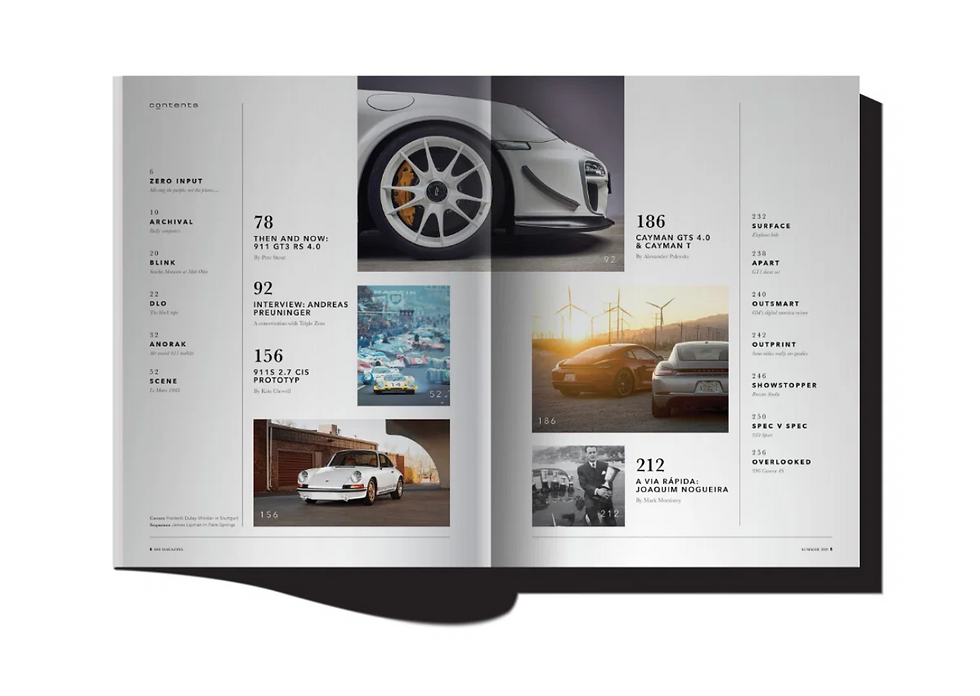
Minimalism and Composition
This layout demonstrates the importance of minimalism and controlled composition. The use of white space ensures that the page does not feel overcrowded, while the grid structure helps organise the images clearly.
For my editorial, I will adopt a similar approach by avoiding excessive elements and focusing on clean spacing and alignment, which will enhance readability and maintain a high-end aesthetic.
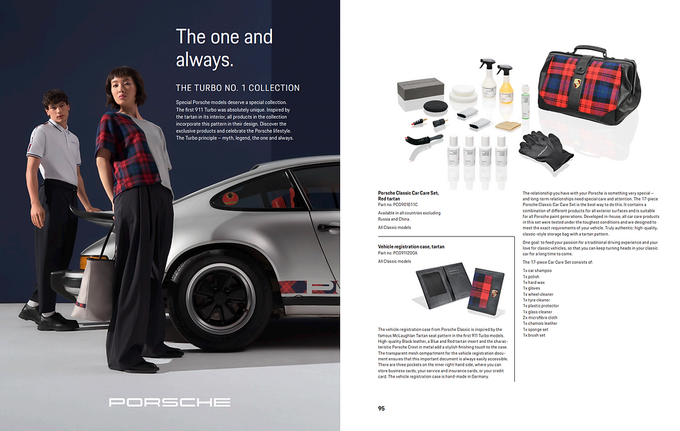
Balance Between Text and Image
In this example, there is a clear balance between written content and visuals, with the text placed on one page and the image on the other. This creates a natural reading flow and allows the audience to engage with both elements without distraction.
I will use this convention in my own work by ensuring that the text supports the images rather than competing with them, creating a more professional and cohesive editorial.
Use of Supporting Images
This layout uses multiple smaller images to show details of the car, adding depth to the article. These supporting visuals help to provide additional information while still maintaining a clean structure.
This has influenced me to include secondary images in my editorial, particularly to highlight specific design features, while keeping the main focus on one dominant image.
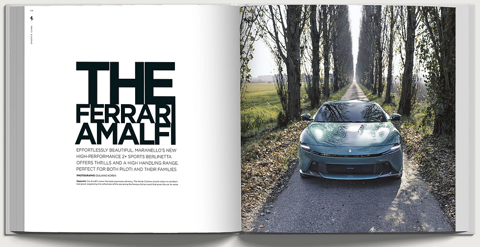
Typography and Visual Impact
Typography is also a key element in creating impact. In this example, the bold and large text immediately draws attention and adds a dramatic effect to the layout. However, it is used selectively, which prevents the page from feeling overwhelming.
In my editorial, I plan to use strong typography for headings only, while keeping the body text simple and readable, ensuring a balance between style and clarity.
Conclusion
Overall, my research into editorial layouts has shown that luxury automotive magazines rely heavily on minimalism, strong imagery, and structured composition. By combining these elements, I aim to create an editorial that reflects a premium aesthetic and appeals to my target audience.
These examples have directly influenced my design decisions, particularly in terms of image placement, use of white space, and typography, which will all contribute to a more professional and visually engaging final product.
Comments